Broniboy
Customer app and restaurant workspace
About the project
Broniboy delivers prepared meals and groceries. Customers place orders in the app, while restaurants accept them, prepare the food and hand it over to a courier.
2020–2022
Role
Product Designer / Product Owner
Scope
User flows and CJM, new features, UI/UX redesign and design reviews.
One order. Two apps.
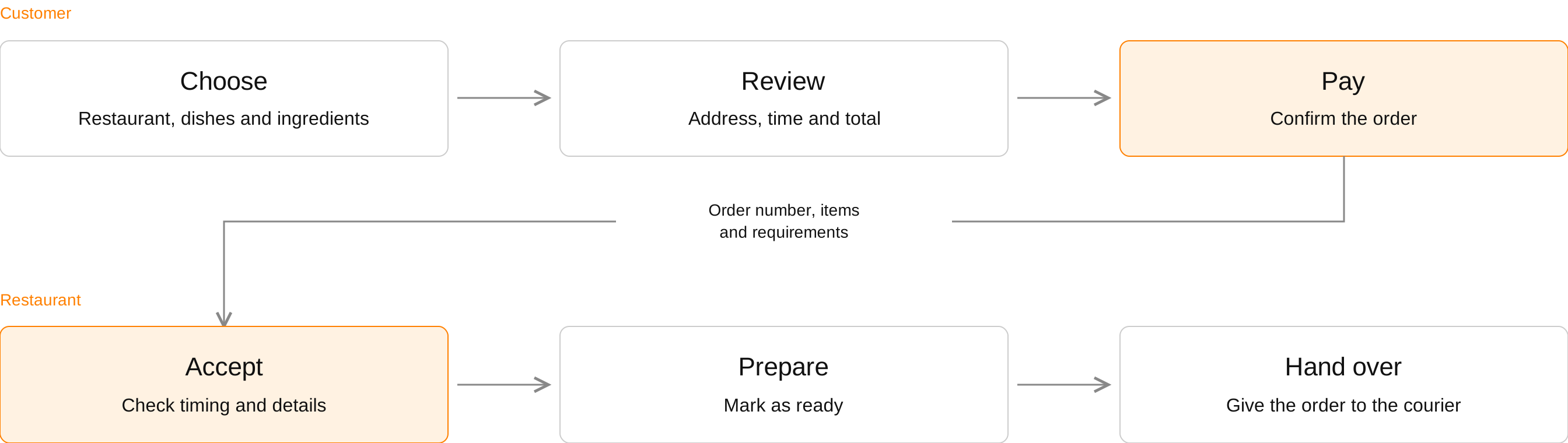
The customer chooses and pays. The restaurant accepts and prepares. One order connects two apps.
The challenge
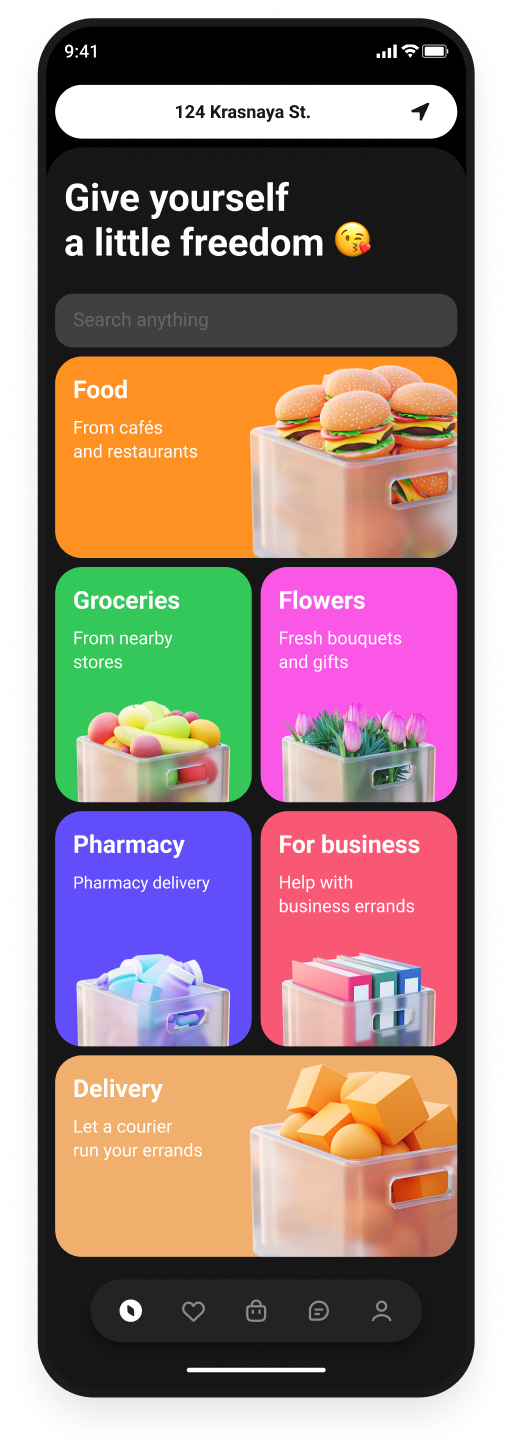
Redesign the customer ordering journey and connect it to the restaurant workflow: from choosing a dish and paying to preparation and courier handover.
My contribution
I developed user flows and customer journey maps for both apps, designed new features, redesigned the UI/UX and conducted design reviews.
One order, two contexts
The customer places and pays for an order. The restaurant receives the same items and requirements, accepts the order and hands it over for delivery.
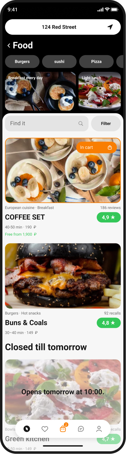
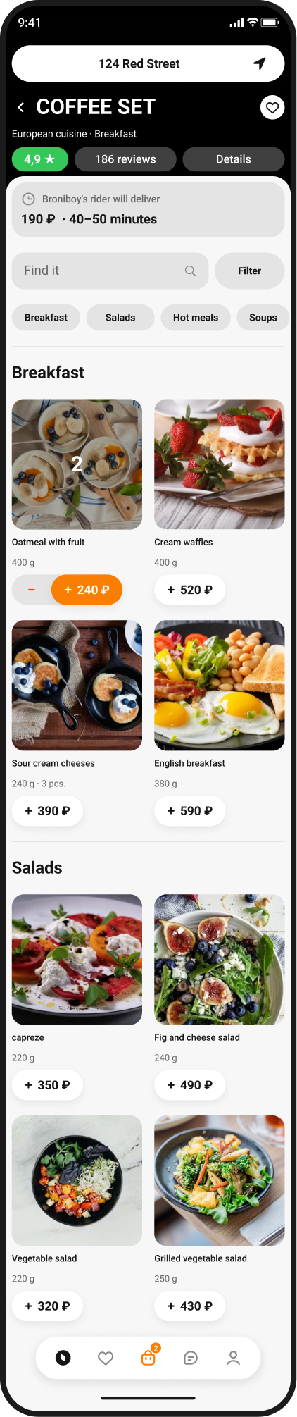
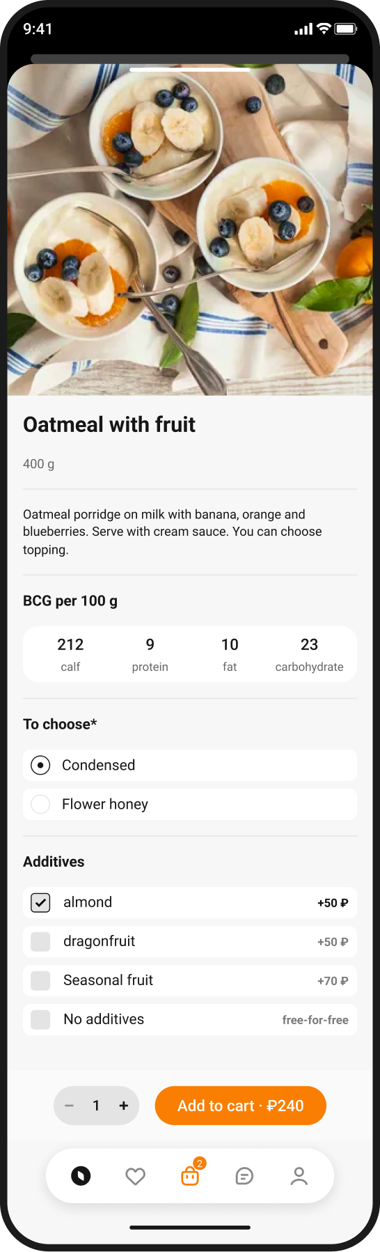
Find a restaurant and choose a dish
Help people move quickly from wanting a meal to choosing a dish: find a suitable restaurant, understand ingredients and pricing, and build an order without unnecessary steps.
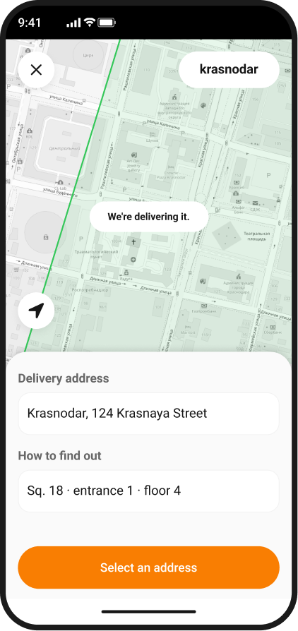
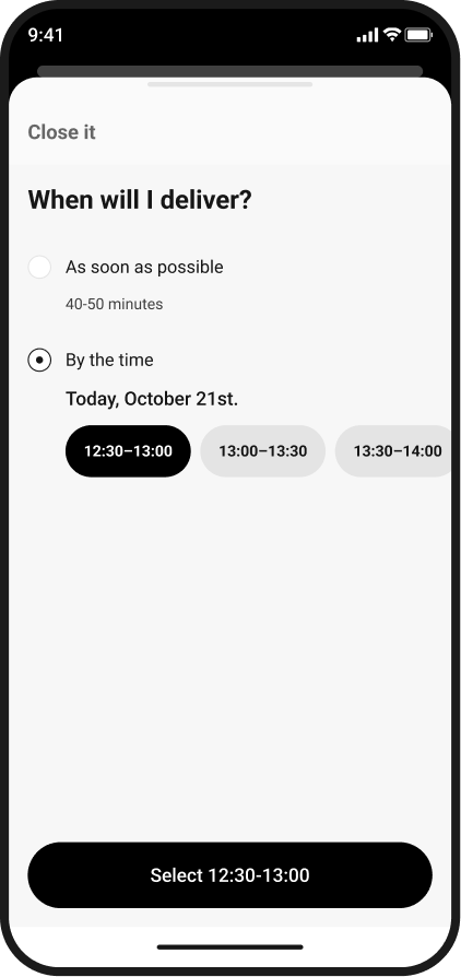
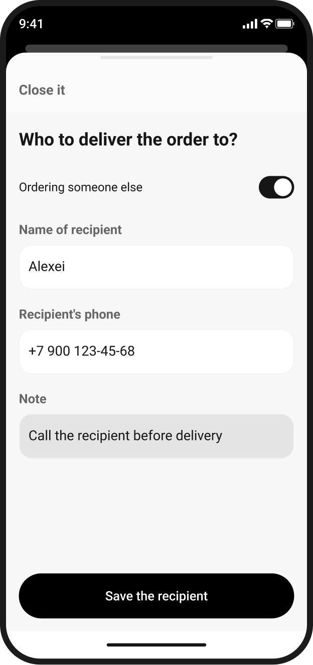
Where, when and how to receive it
Give people control over delivery: check the address, choose a time and specify another recipient. Changing one detail should not mean rebuilding the basket.
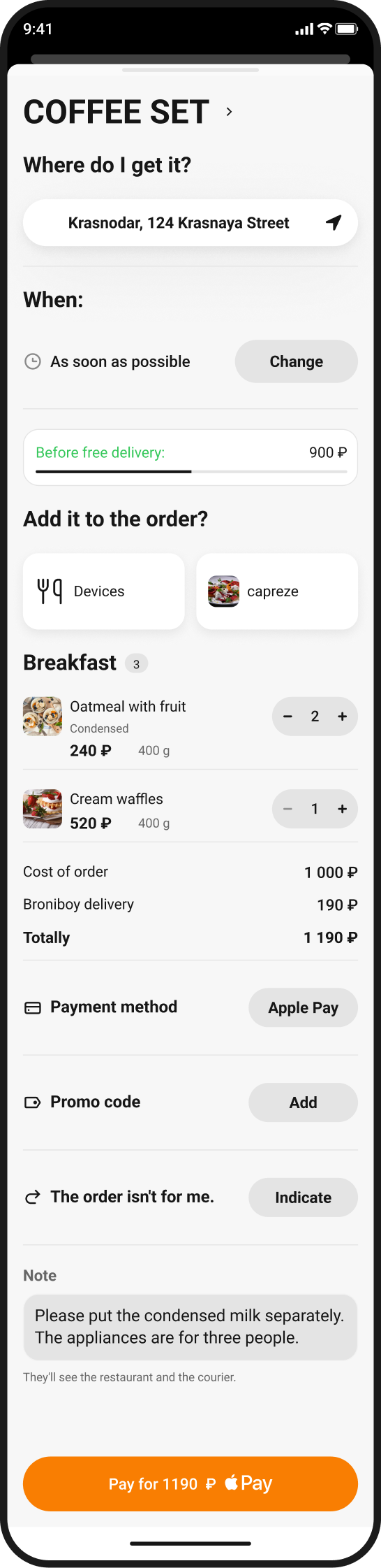
Review the order and confirm payment
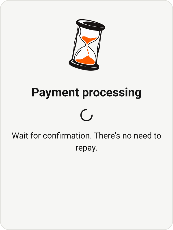
Before paying, people need to understand the total cost and order conditions. After submitting payment, they need a clear confirmation or a way to continue with their basket and details preserved.
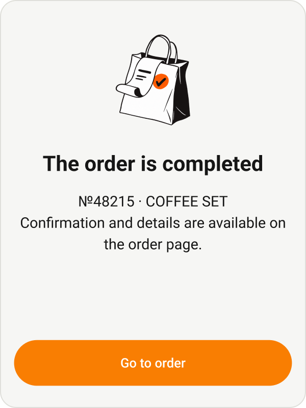
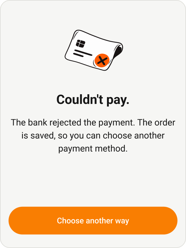
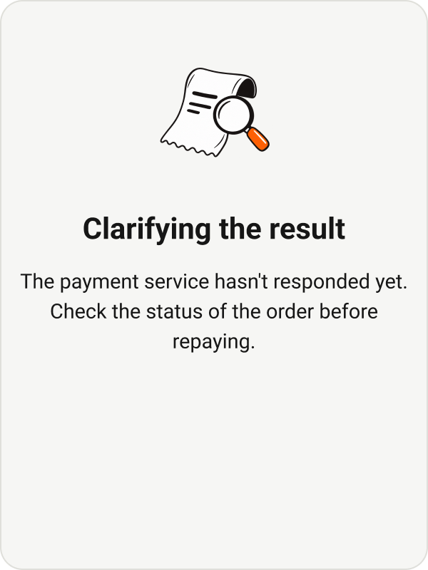
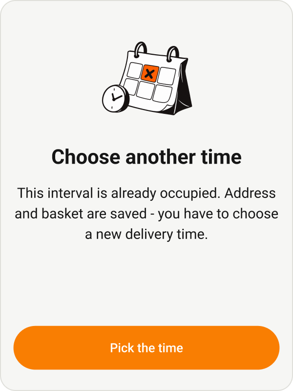
Errors are part of the flow
If a payment is declined, its outcome is still unknown or the chosen time is unavailable, the interface explains the next step. The basket and entered details stay in context.
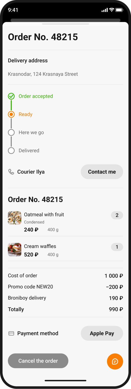
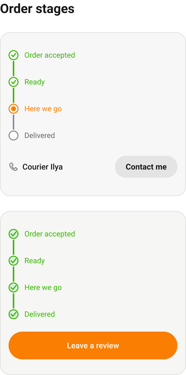
After payment, the order stays visible
Preparation, courier handover and delivery stages help people understand what is happening with their order. Courier contact details and support are available beside the order information.
The restaurant sees the next step
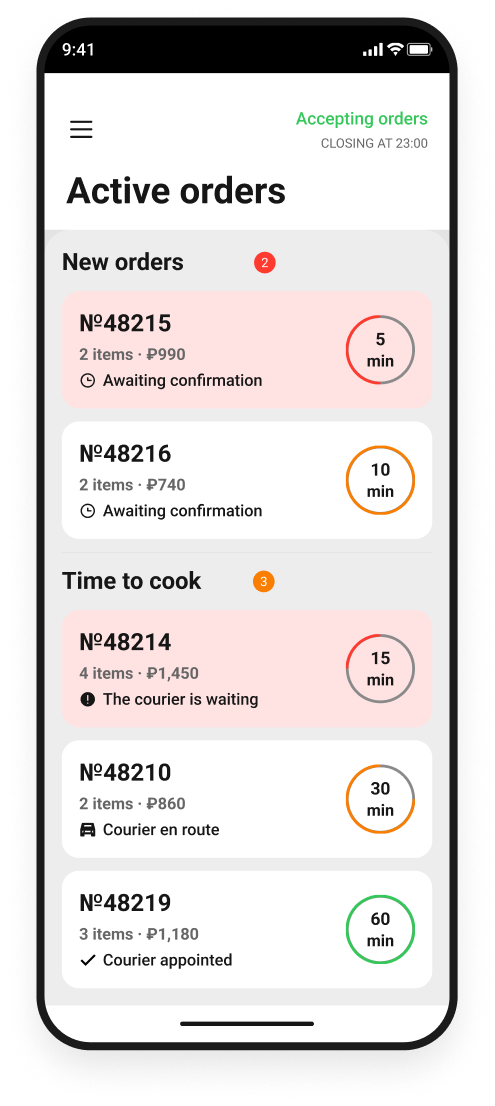
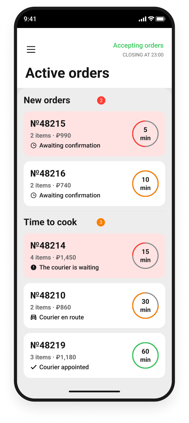
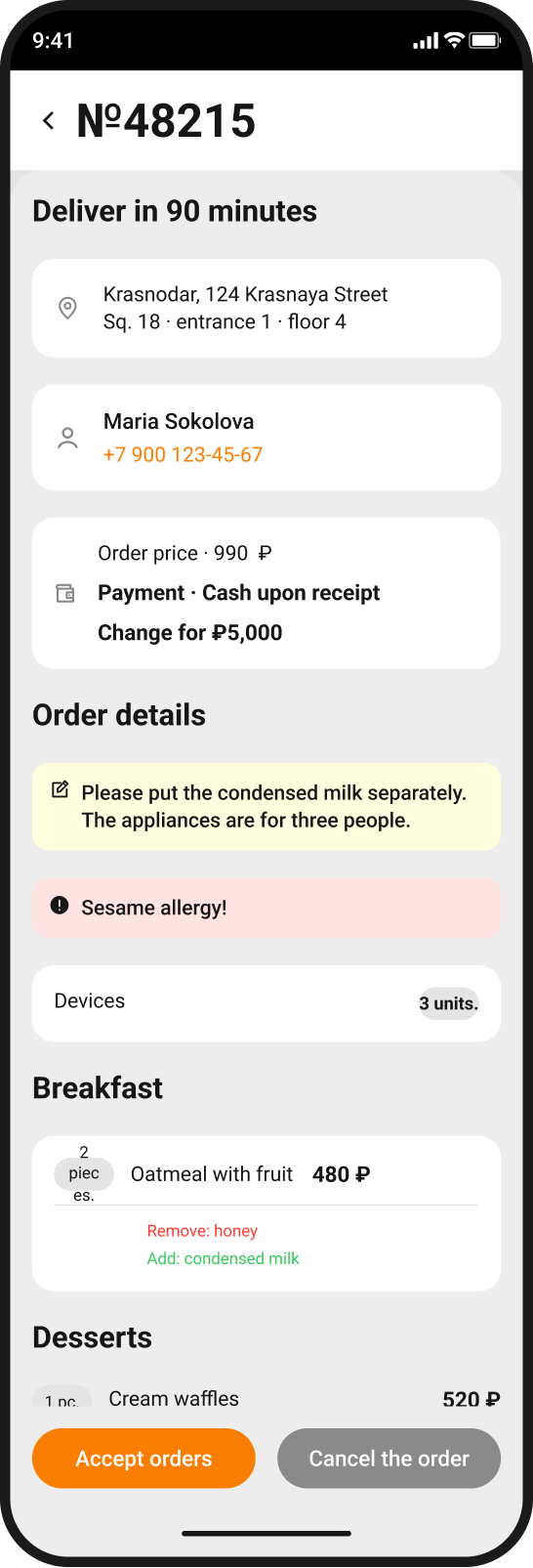
Help staff accept orders on time and keep track of important details in the queue. Items, timing, payment and customer requests are in one place; the next step depends on the current status.
Dish availability and order history
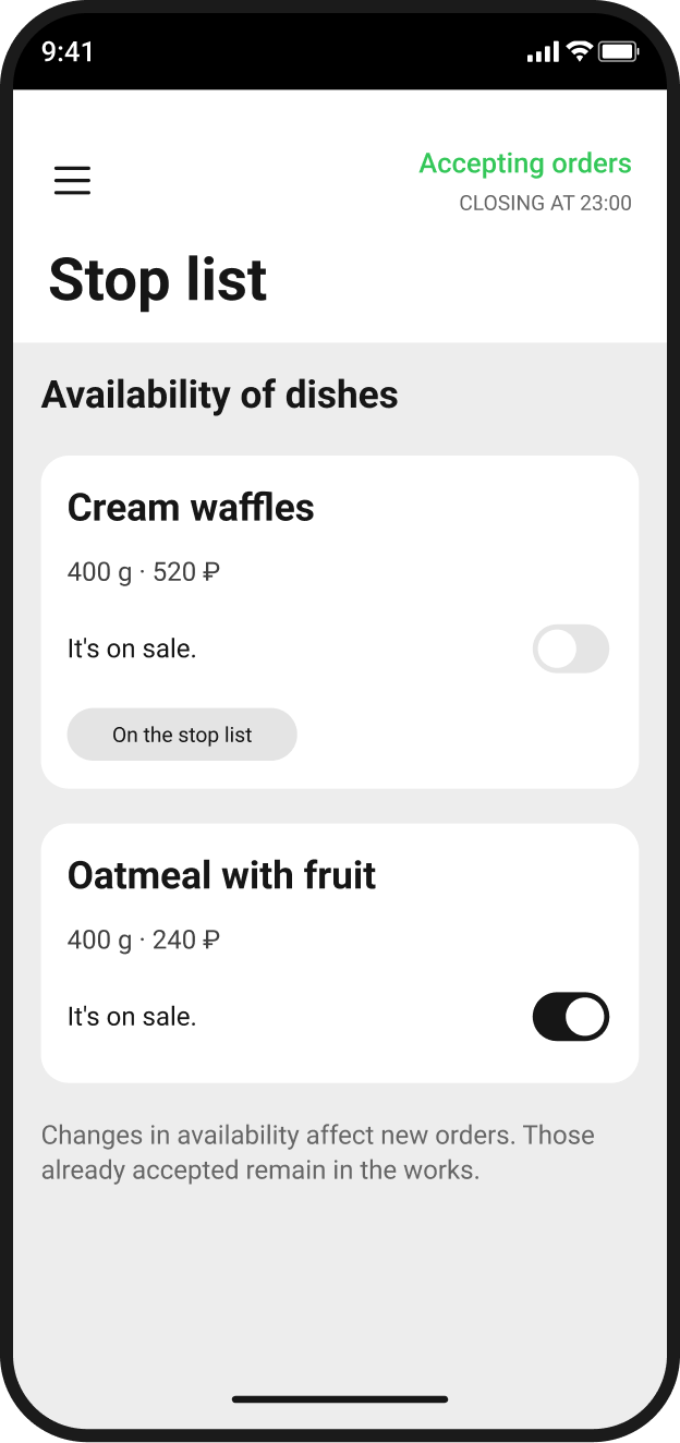
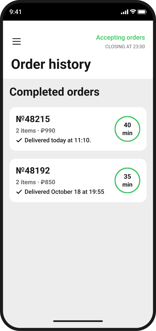
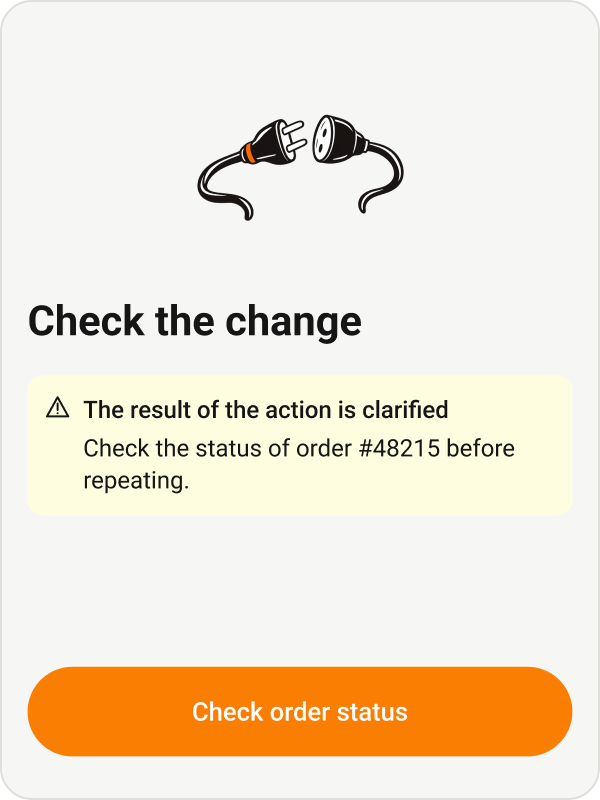
Manage dish availability, check the outcome of changes and revisit completed orders. The unavailable items list affects new orders; history preserves past order details. If the service has not responded, staff can check the action status.
Design system
One library for two apps. A shared foundation keeps the service consistent, while ordering components support the different needs of customers and restaurants. Below is a selection of actual elements at their original scale.

Marketing and communications
Marketing and design team leadership / 2020–2022
One service. Different people. A shared identity.
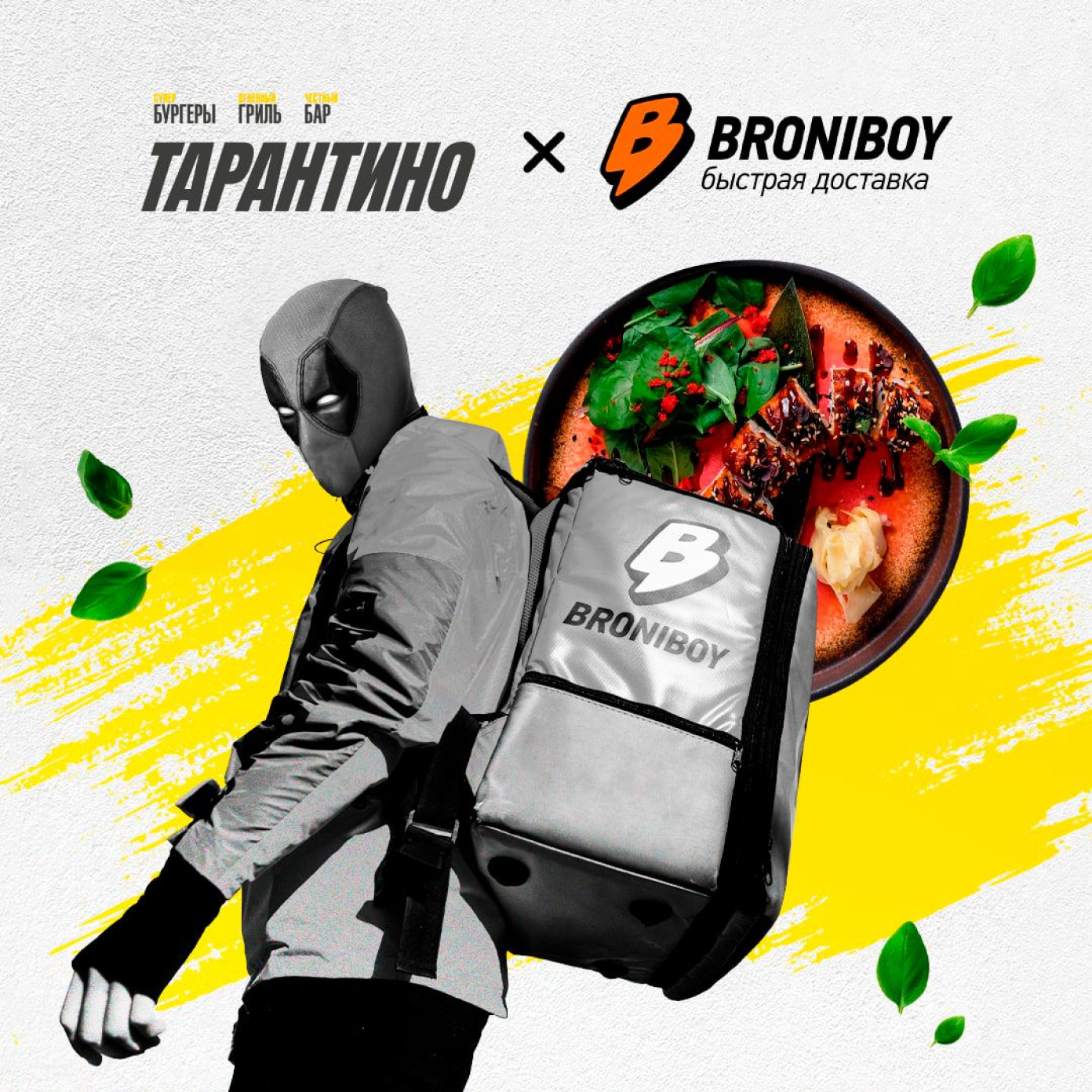
A recognisable delivery brand across different touchpoints.
Marketing and design team leadership 2020–2022
My role
Alongside designing the apps, I led marketing and the design team at Broniboy. This section shows how the service's visual communication evolved and how we addressed customers, couriers and partners.
2020–2022
Social media, advertising creatives, outdoor and print materials.
How the feed changed
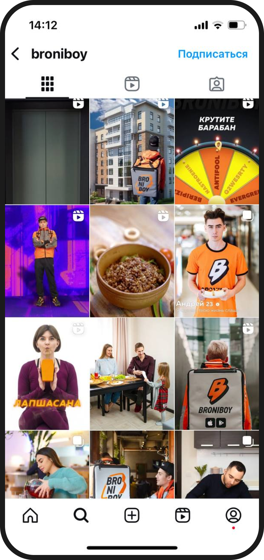
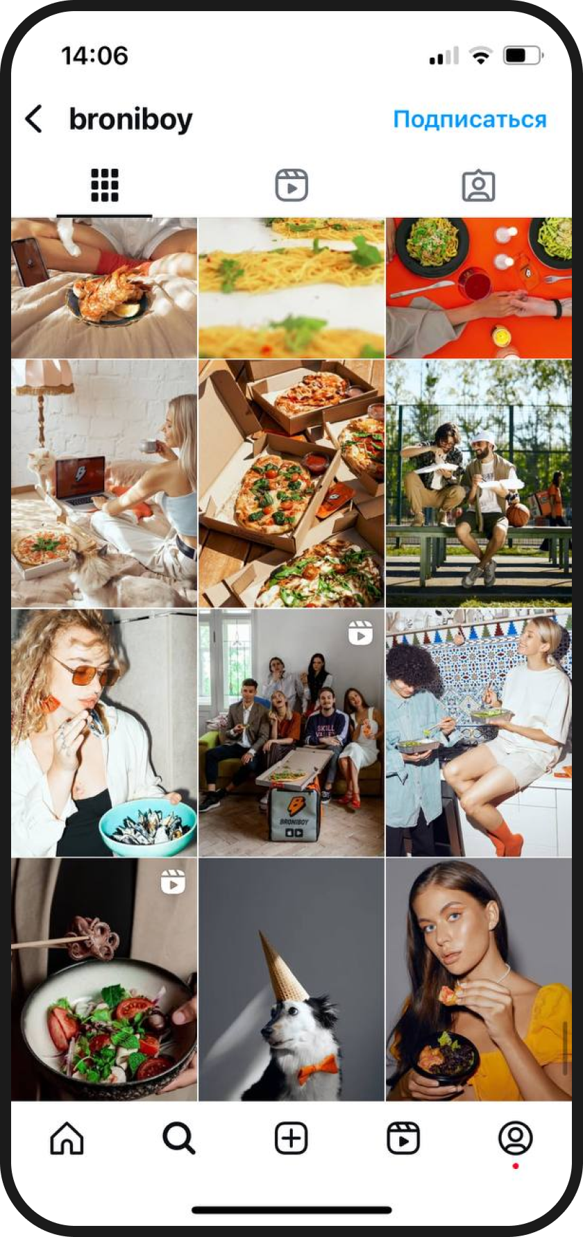
Before my involvement, the feed mixed advertising creatives, brand characters and courier scenes. The new approach put food, people and everyday situations centre stage. Below are archived feeds from before and after the changes.
Before my work
After my work
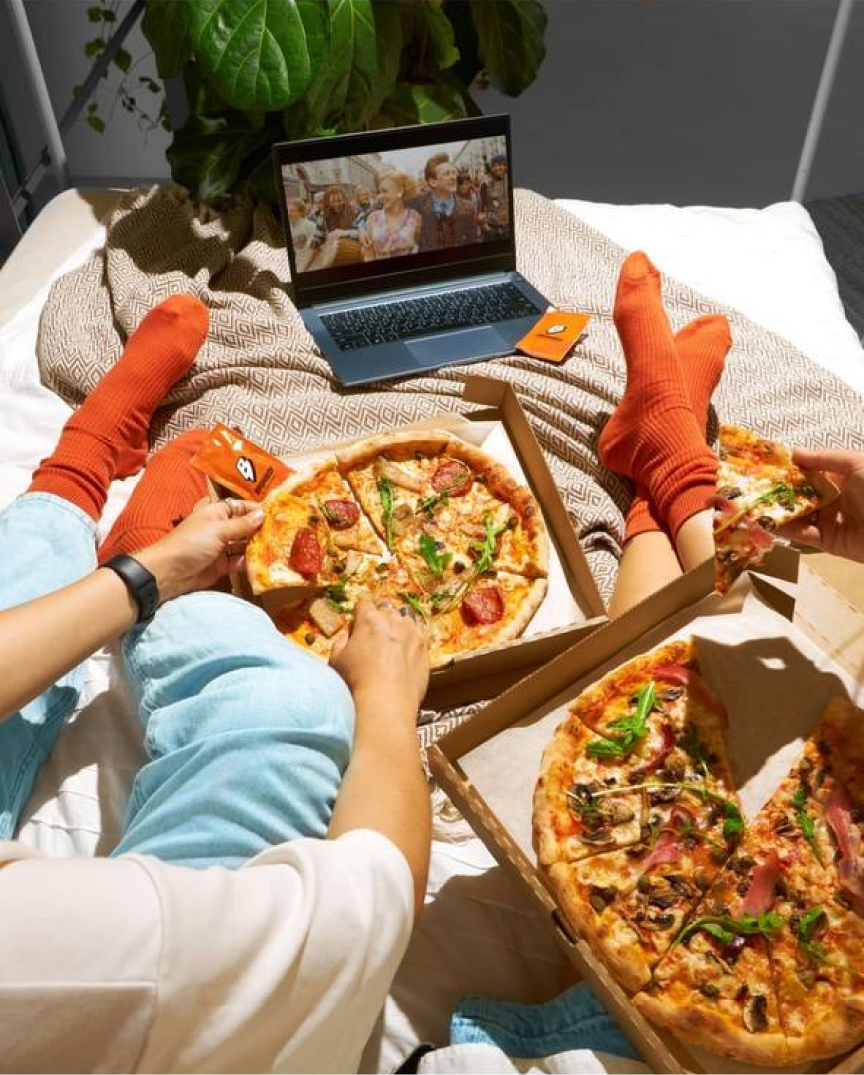
Brand details in the frame
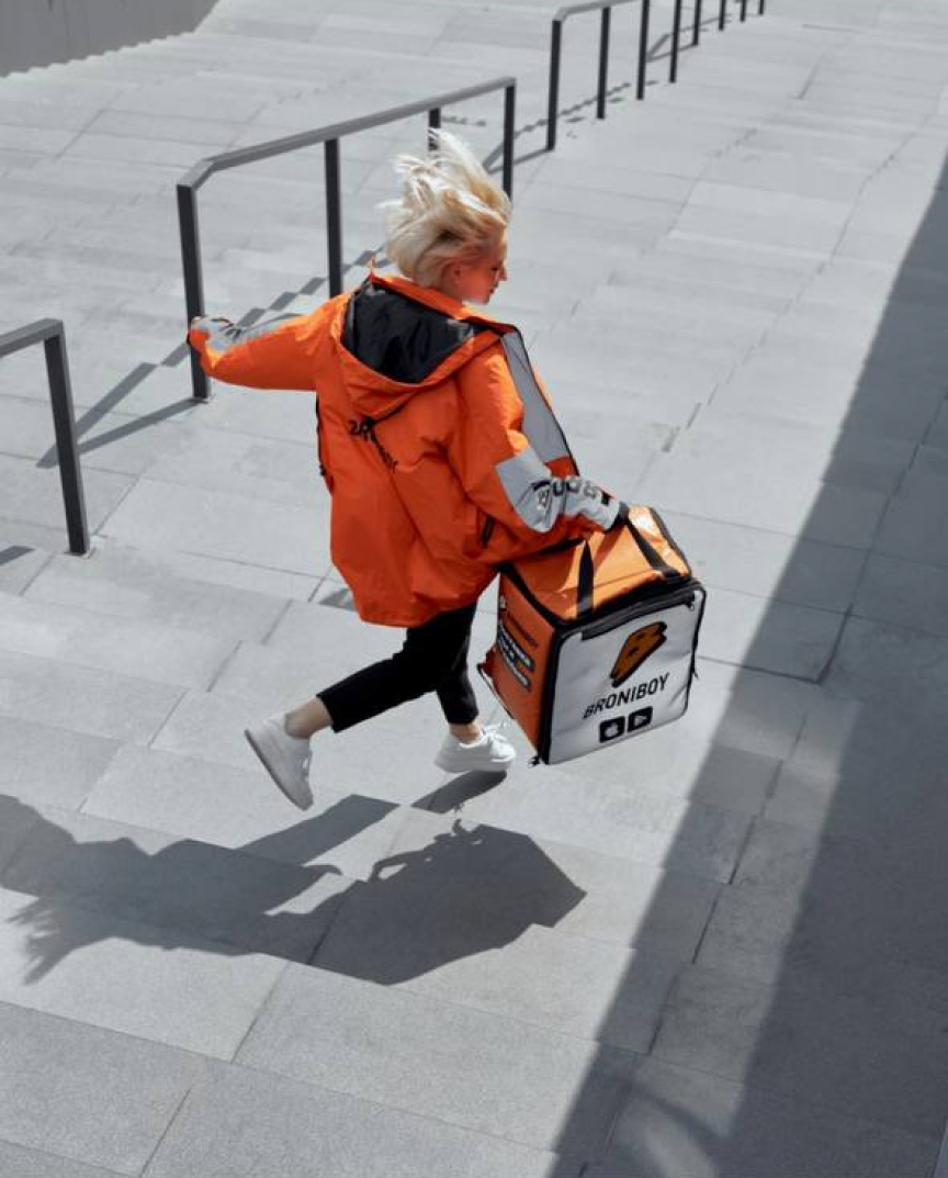
For shoots, we deliberately added branded details: napkins, socks and other accessories. They connect food and everyday situations with Broniboy, making the brand recognisable within the image before any advertising caption.

A shared identity. Different messages.
Orange and black, a prominent logo, close-ups of food and expressive typography recur across materials. This common foundation lets the story and offer change.
Contrast
Colour and bold accents make the brand easy to notice.
Recognisable imagery
Couriers, food and the logo connect different stories to delivery.
A clear message
The benefit or reason to order is presented beside the main image.
Reasons to order
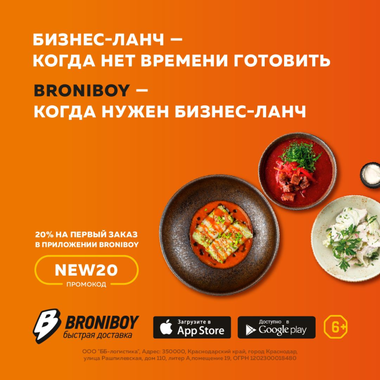
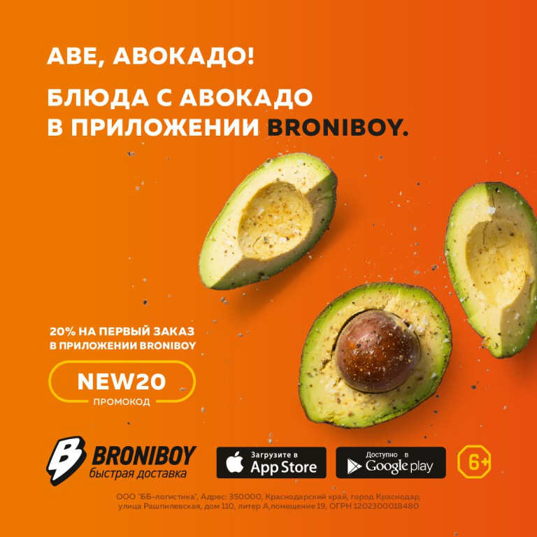
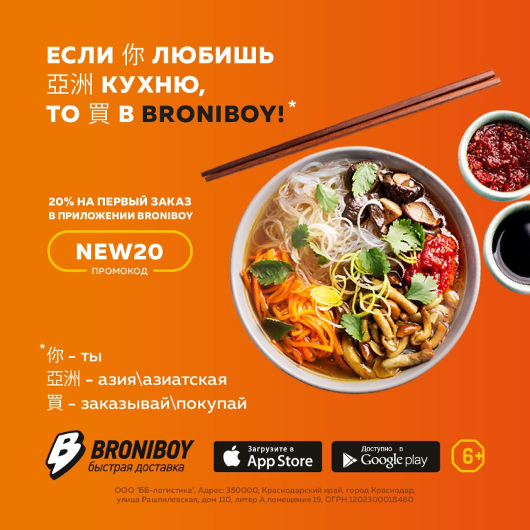
Business lunches, pan-Asian food, avocado dishes and a children's menu offer different reasons to order delivery. The creatives share one visual system: a prominent offer, food and a clear next step. A discount and the NEW20 promo code connect the offer to a first order.

Different audiences. Different actions.
Separate two messages: invite couriers to join the team and give customers a reason to order. The poster leads to a job opening. The bus shelter ad presents an offer, a promo code and a route to ordering. A shared visual language keeps the brand recognisable.
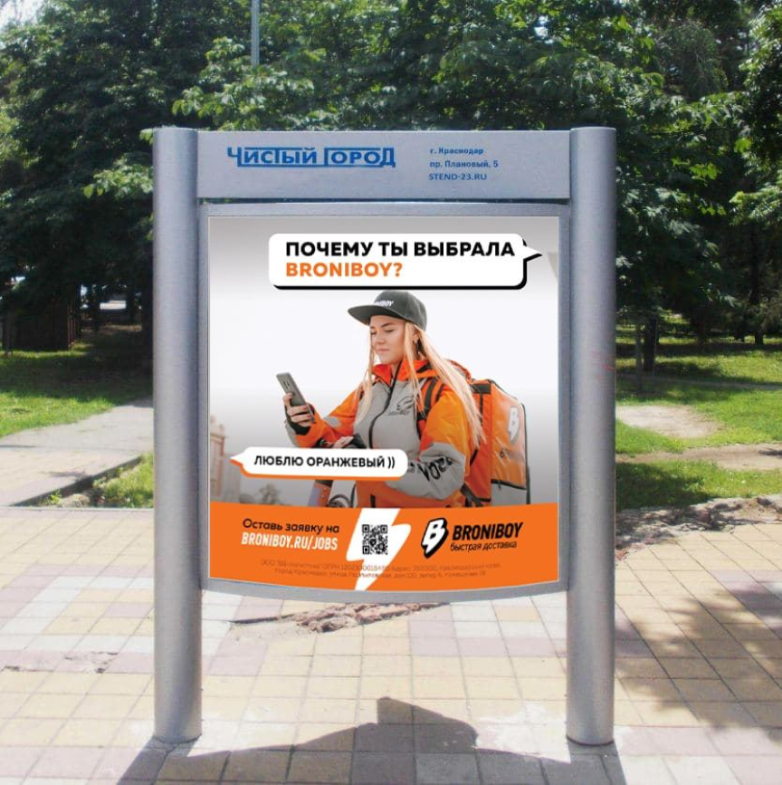
For couriers: an invitation to join
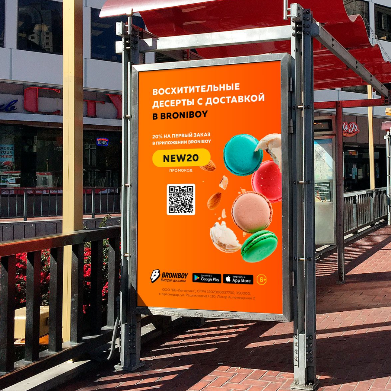
For customers: a reason to order
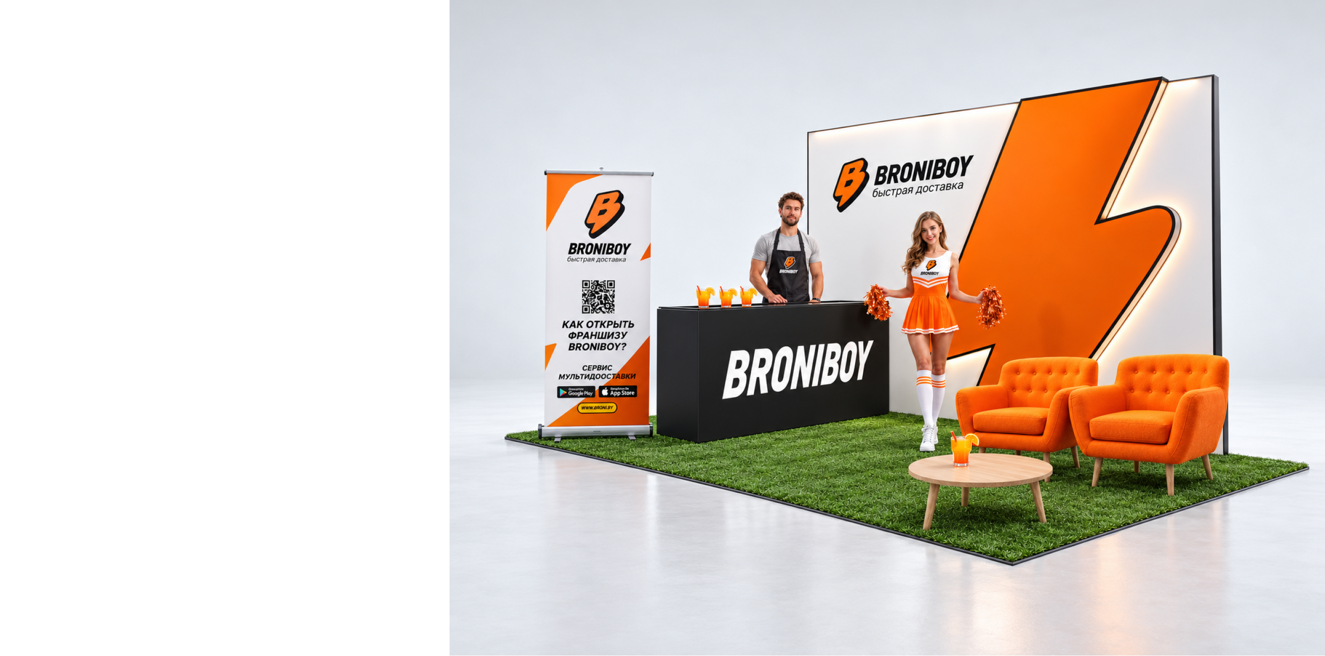
The brand as a space
In the exhibition stand concept, the recognisable logo becomes the central spatial element. Colour, bold form and a place to talk extend the character of the brand's communication.
Have a project
for a product designer?
Send me a link to your product and a few words about what needs to change. I will review the task and suggest a suitable way to work together. Written communication works best for project discussions.